Post-Content
Post-Content LinkPositioning
Brand Identity —
The Way We See It
Your theme includes brand-approved styling that controls the look and feel of your creative. Take a look at our video to really understand the power of themes. Then as you review your theme, take a peek at the tooltips ( ) along the way that explain how your theme affects that element.
Why?
The beauty of working together is that everybody has their own ideas and perspectives. However, if we want to build something truly amazing together we have to agree on a solid foundation. The purpose of the brand identity is to make sure we are all united as one. With a cohesive message, look and feel.
How?
As rockers, you will use this document as a solid foundation for your work and as a guide to how to communicate internally and externally about the Rock Content brand. The guide won’t solve every brand question you’ll encounter, so we have created the #ask-a-brand-guardian community Slack channel to answer any questions that come up that are not addressed in the guidelines.
Parent Brand
Our parent brand Rock Content was created to easily help marketers create content that rocks. It’s a marketing solution framework, that enables premium content experiences.
The brand icon represents content production, inspired by a paper filled with lines. While the name was inspired by rock music and the informal use of the word rock (rocking, rocked) as a way to describe stirring things up and the display of something to great affect. It also provides the symbolism of strength and stability, two qualities we strive for as a company. Meanwhile, the use of the word content is used to give context to the solutions and services that we offer.
Our logo is the core identity of our brand. In order to maintain cohesiveness rockers should adhere to the following guidelines.
Main Logo
Logo Color Options
For greater prominence and clarity the full color version of the logo is to be used on any white background. In cases where the background presents the light colors, use the all black version, and on dark backgrounds the ideal choice is the all white logo as to not compromise legibility.
Icon
For greater prominence and clarity the full color version of the logo is to be used on any white background. In cases where the background presents the light colors, use the all black version, and on dark backgrounds the ideal choice is the all white logo as to not compromise legibility.
Scale
The smallest application of our logo in both print and web is 20 pixels high / 0.7 centimeters high.
134 px x 20 px
168 px x 25 px
201 px x 30 px
235 px x 35 px
302 px x 45 px
369 px x 55 px
Language
When talking and writing about our company we say the full company name Rock Content, in title case when written. We do not just write or say Rock on its own.
Products
Our main products are used by our customers in long-term partnerships to help create premium content experiences, built to scale. They can be used as a single platform or used within our ecosystem of products for a more complete package.
At Rock Content we are constantly evolving to help meet the needs of our customers. New products are born with unique features without losing our personality, below are all products offered by Rock Content.

Ion
Ion is Rock Content’s interactive content software solution that can create engaging data-driven experiences without tech-savvy resources or developer code.
Live
Live is a live reporting and social engagement software solution. It helps users connect with remote and virtual audiences by providing real-time updates, curating social media, and delivering live content experiences.
Stage
Stage is a complete WordPress platform, with managed hosting and tools, focused on what the marketer needs: reaching their audience and generating business. Safe, stable and optimized for generating results without the need for technical knowledge.
Studio
Studio is a collaboration and resource management tool. It unleashes collaboration through technology to allow marketeers to centralize and manage all processes from strategy planning to result measurement. It is a collaborative environment that connects Rock professionals, the client team and our freelancers.
Visually
Visually is Rock Content’s North America talent network and collaboration software. It is often used as an extension of an existing team to help produce high-impact content, by connecting customers to the best talent and collaborating with them directly through the platform.
Sub-brands
Rock University
Rock University is Rock Content’s premium teaching center that teaches the biggest topics in Digital Marketing in an accessible and simplified way. It was created to help professionals gain the necessary skills to work in the current digital marketing world, offering free and paid courses.
The language used is educational.
Rock.org
Rock.org is a platform for sharing knowledge in order to accelerate social change. It is based on the pillars of education, entrepreneurship, and volunteering. Created on the belief that creating opportunities generates growth at a personal, professional, and financial level.
The language used is inspiring and motivational.
Colors
White
White Transparent
Black Transparent
Black
Gray/50
#F7FAFD
RGB (247,250,253)
CMYK (2,1,0,0)
Grey/100
#EDF1F7
RGB (237,241,247)
CMYK (5,2,1,0)
Grey/200
#E2E7F0
RGB (226,231,240)
CMYK (10,6,2,0)
Grey/400
#A0ABC0
RGB (160,171,192)
CMYK (38,27,14,0)
Grey/600
#4A5568
RGB (74,85,104)
CMYK(74,62,42,23)
Grey/800
#1A202C
RGB(26,32,44)
CMYK(83,74,55,67)
Blue/50
#F5F8FF
RGB (245,248,255)
CMYK (3,1,0,0)
Blue/100
#C0D6FF
RGB (192,214,255)
CMYK (21,10,0,0)
Blue/200
#8BB3FD
RGB (139,179,253)
CMYK (41,23,0,0)
Blue/400
#3576ED
RGB (53,118,237)
CMYK (79, 55, 0, 0)
Blue/600
#1649bc
RGB (22,73,188)
CMYK (92,72,0,0)
Blue/800
#0B2574
RGB (11,37,116)
CMYK (100,95,24,15)
Purple/50
#F9F7FF
RGB (249,247,255)
CMYK (2, 2, 0, 0)
Purple/100
#DAD2FF
RGB (218,210,255)
CMYK (12,16,0,0)
Purple/200
#BAADFC
RGB (186,173,252)
CMYK (27,31,0,0)
Purple/400
#826deb
RGB (130,109,235)
CMYK (66,61,0,0)
Purple/600
#5647bb
RGB (86,71,187)
CMYK (81,76,0,0)
Purple/800
#2D2673
RGB (45,38,115)
CMYK (100,100,23,10)
Pink/50
#FFF5F9
RGB (255,245,249)
CMYK (0,4,0,0)
Pink/100
#FFC2D9
RGB (255,194,217)
CMYK (0,30,0,0)
Pink/200
#FF90BB
RGB (255,144,187)
CMYK (0,56,1,0)
Pink/400
#f23f87
RGB (242,63,135)
CMYK (0,85,10,0)
Pink/600
#b21056
RGB (178,16,86)
CMYK (21,100,37,13)
Pink/800
#590129
RGB (89,1,41)
CMYK (42,98,59,55)
Orange/50
#fff9f6
RGB (255,249,246)
CMYK (0,3,3,0)
Orange/100
#ffd0b8
RGB (255,208,184)
CMYK (0,25,27,0)
Orange/200
#ffa77a
RGB (255,167,122)
CMYK (0,44,52,0)
Orange/400
#f46421
RGB (244,100,33)
CMYK (0,71,90,0)
Orange/600
#a42600
RGB (164,38,0)
CMYK (23,91,100,20)
Orange/800
#5f2102
RGB (95,33,2)
CMYK (38,86,96,59)
Yellow/50
#FFF9ED
RGB (255,249,237)
CMYK (0,2,6,0)
Yellow/100
#FFECBB
RGB (255,236,187)
CMYK (1,6,31,0)
Yellow/200
#FFDD87
RGB (255,221,135)
CMYK (1,12,56,0)
Yellow/400
#ffb92e
RGB (255,185,46)
CMYK (0,32,85,0)
Yellow/600
#883E01
RGB (179,92,0)
CMYK (23,71,100,11)
Yellow/800
#5F2102
RGB (95,33,2)
CMYK (37,84,99,55)
Green/50
#EEFCF3
RGB (238,252,243)
CMYK (5,0,5,0)
Green/100
#BDEFCE
RGB (189,239,206)
CMYK (25,0,25,0)
Green/200
#88DFA5
RGB (136,223,165)
CMYK (45,0,47,0)
Green/400
#2aa254
RGB (42,162,84)
CMYK (78,6,84,0)
Green/600
#0d6331
RGB (13,99,49)
CMYK (89,34,96,28)
Green/800
#0B371F
RGB (11,55,31)
CMYK (85,48,87,63)
Teal/50
#ECFCFC
RGB (236,252,252)
CMYK (6,0,2,0)
Teal/100
#C1F9F8
RGB (193,249,248)
CMYK (21,0,6,0)
Teal/200
#8FEBEA
RGB (143,235,234)
CMYK (38,0,13,0)
Teal/400
#1c9bb5
RGB (28,155,181)
CMYK (76,19,24,2)
Teal/600
#006666
RGB (0,102,102)
CMYK (90,42,55,22)
Teal/800
#003333
RGB (0,51,51)
CMYK (91,58,64,59)
Cyan/50
#eafafc
RGB (234,250,252)
CMYK (10,0,3,0)
Cyan/100
#b9eff9
RGB (185,239,249)
CMYK (30,0,7,0)
Cyan/200
#8ce5f5
RGB (140,229,245)
CMYK (44,0,9,0)
Cyan/400
#1c9bb5
RGB (28,155,181)
CMYK (76,19,24,2)
Cyan/600
#0a6275
RGB (10,98,117)
CMYK (88,42,38,24)
Cyan/800
#043542
RGB (4,53,66)
CMYK (96,62,50,53)
Teal — Blue Gradient
#39D2D2 – #3576ED
RGB (57, 210, 210) – RGB (53, 118, 237)
Purple — Blue Gradient
#826DEB – #3576ED
RGB (130, 109, 235) – RGB (53, 118, 237)
Blue 100 — 400 Gradient
#C0D6FF – #3576ED
RGB (192, 214, 255) – RGB (53, 118, 237)
TEXT COLORS
BLUE — Tints & Shades
Blue/50
Blue/100
Blue/200
Blue/400
Blue/600
Blue/800
CYAN — Tints & Shades
Cyan/50
Cyan/100
Cyan/200
Cyan/400
Cyan/600
Cyan/800
GRAY — Tints & Shades
Gray/50
Grey/100
Grey/200
Grey/400
Grey/600
Grey/800
GREEN — Tints & Shades
Green/50
Green/100
Green/200
Green/400
Green/600
Green/800
ORANGE — Tints & Shades
Orange/50
Orange/100
Orange/200
Orange/400
Orange/600
Orange/800
PINK — Tints & Shades
Pink/50
Pink/100
Pink/200
Pink/400
Pink/600
Pink/800
PURPLE — Tints & Shades
Purple/50
Purple/100
Purple/200
Purple/400
Purple/600
Purple/800
RED — Tints & Shades
Red/50
Red/100
Red/200
Red/400
Red/600
Red/800
TEAL — Tints & Shades
Teal/50
Teal/100
Teal/200
Teal/400
Teal/600
Teal/800
YELLOW — Tints & Shades
Yellow/50
Yellow/100
Yellow/200
Yellow/400
Yellow/600
Yellow/800
Typography
FONT STYLES
Inter Extra-light
Inter Light
Inter Regular
Inter Medium
Inter Semi-Bold
Inter Bold
Inter Extra-bold
Manrope Extra-light
Manrope Light
Manrope Regular
Manrope Medium
Manrope Semi-bold
Manrope Bold
Manrope Extra-bold
TEXT STYLES
Display Headline
Headline 1
Headline 2
Headline 3
Headline 4
Headline 5
Headline 6
Lorem ipsum dolor sit amet, consectetur adipiscing elit. Integer tincidunt mi ac sem lobortis, finibus vulputate nulla commodo. Fusce auctor orci quis odio consectetur, nec porta lorem fermentum. Mauris porta, lectus in sodales porttitor, leo neque feugiat libero, vitae semper libero neque vitae augue.
Vivamus lacinia, ligula eget congue fringilla, ipsum leo euismod est, et molestie tortor arcu non sem. Sed quis nunc auctor est consequat elementum vel sed dui. Etiam tempus dignissim diam, rhoncus consequat elit tincidunt vitae. Aliquam bibendum ex tincidunt pellentesque rutrum.
Caption
Fine Print
LIST STYLES
Unordered List Style (Default)
- Example Bullet
- Example Bullet
Bullet A
- Example Bullet
- Example Bullet
Ordered List Style (Default)
- Example Bullet
- Example Bullet
Bullet B
- Example Bullet
- Example Bullet
Imagery
Photography Guidelines
At Rock Content we prefer to use colorful, bold photography that conveys community, authenticity, and diversity. We are constantly adding to our Rock Stock collection of photography to give anyone operating within the Rock Content brand a good range of photographs to choose from.
Our photography should set the scene or create context for the transformational conversations we want to have. It should demonstrate our interest in the world around us, and the positive effects we’re working to deliver as Rockers.

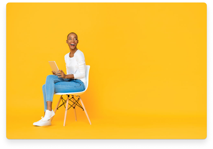
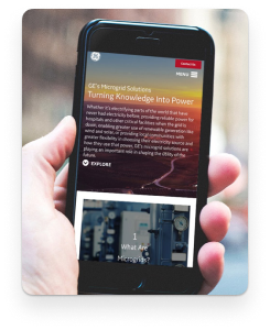


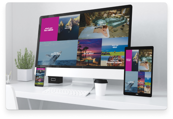
Photo Types
Given our scale and scope, no single photographic style can capture the variety of subjects or themes we need to convey. Different types of images are better suited for certain situations and subject matter. We’ve developed a definitive perspective on the types of imagery that best define Rock Content in both style and substance.
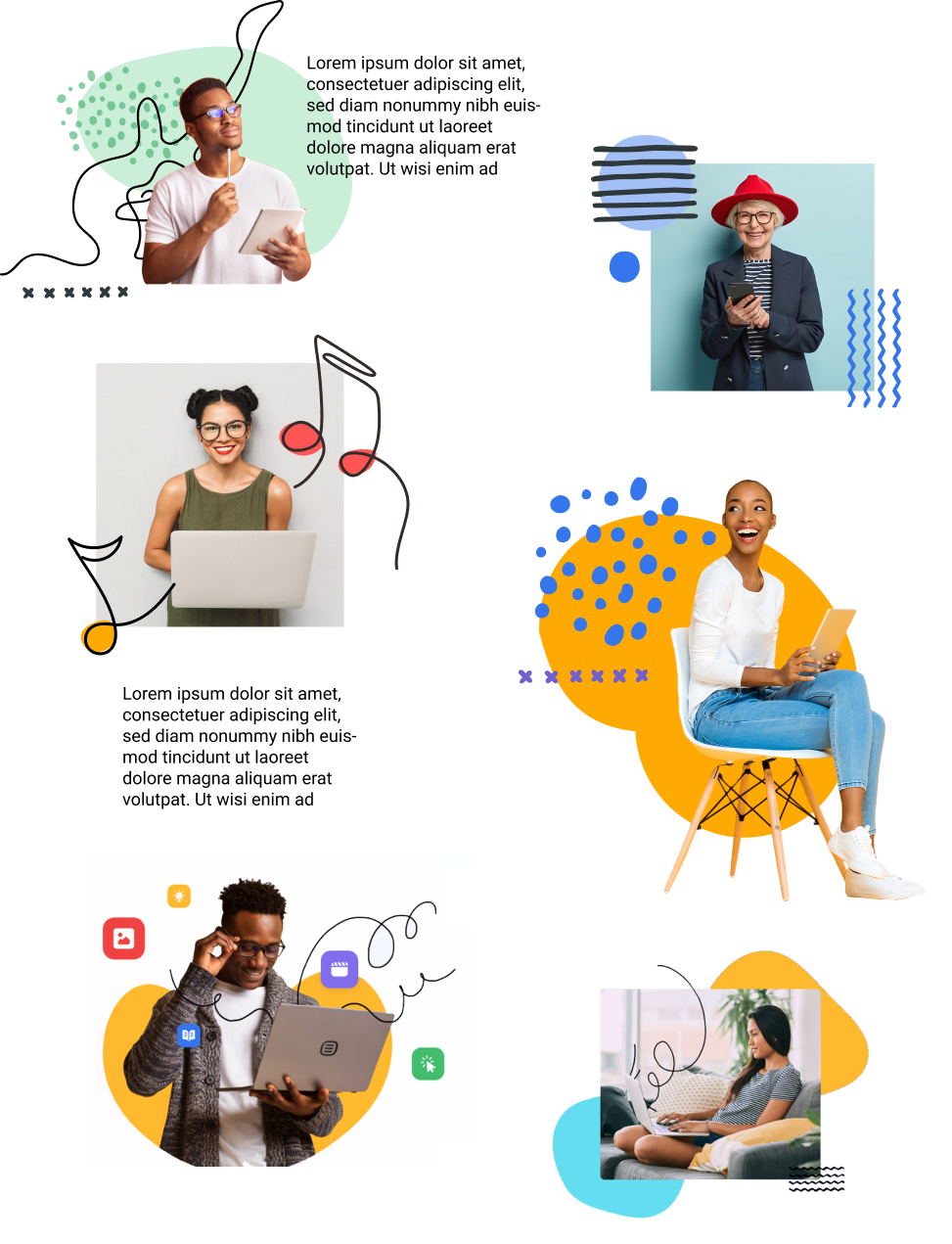
Lifestyle: Authentic Moments
The bulk of the photography we use is lifestyle imagery that captures candid moments with genuine expressions. We strive to create authentic moments that express our customers individuality while highlighting our products. The lifestyle images should have personality shine through while weaving Rock Content’s brand story into an image.


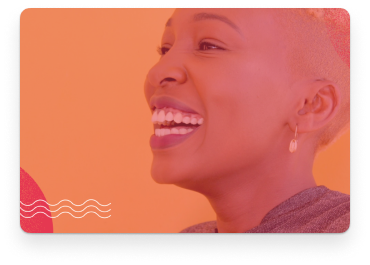
Portraiture: Customers and their audience
At Rock Content we want to highlight our customer as a hero, for this reason, we want to use bold colorful images. They should capture happy customers and their audiences, to enforce our message, we help our customers build content experiences their audiences will love. The portraits should also represent our very diverse customers. As a global company, it’s very important for every ethnicity, gender, and identity type to feel represented. We want to embrace diversity through our images and visual language.


Photography Overlays
Photography overlays are a great way to add contrast to images and to use for an image that are overlaid with copy. We have various overlay options, utilizing the different colors from our color palette at a transparency of 45%-65%.


Illustrations
Our main visual language uses high quality photography that’s relatable to our clients and their audiences. However, there are various instances where photography is not the best medium to communicate something visually. In those instances, we prefer to use custom illustrations.
Rock Content is a youthful brand defined by its many young and innovative leaders and customers. It is with this in mind that a playful and hand-drawn approach was crafted. Our brand illustrations are composed of simple flat outline drawings contrasted with bold blocks of color and large amounts of negative white space. This creates an interesting dynamic and defines our own unique illustration language.
Goals
The goal of illustrations at Rock Content is to add value to a design. They can do this by adding educational value, aesthetic value, and brand value.
- Educational Value: used to educate the user and help draw attention to specific features across a product or service.
- Aesthetic Value: used to add personality and individuality to any design.
- Brand Value: used to humanize our brand through hand-drawn elements that reinforce trust and creativity.
Our Approach
Keeping it simple. Our brand aesthetic is clean, minimal, bold and creative. For this reason we want to keep the style and concept simple. By using minimal details and a minimal color palette, simplicity can be achieved.
Style Guide
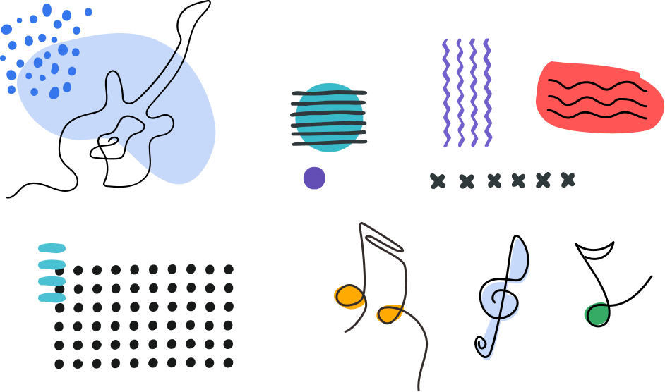
Decorative Elements
In order to add aesthetic and brand value, we want to use simple and playful illustrations to add to any design project. These elements can be used independently or with other imagery to give a design personality. Rock Content design elements include hand-drawn shapes and lines inspired by music and technology. Elements should never be the primary focus of a design. We should use them to add personality to a design, as well as to address the need to fill an empty area and to energize a possible lifeless area.
Example:
Layout Examples:
Spot Illustrations
A spot illustration is used to help showcase a product feature, demonstrate a user experience, or explain a simple gesture. They’re lightweight, not too busy, but are there to help enhance a design by bringing the layout to life and inform the viewer.
Example:


Scene Illustrations
A scene illustration works on a larger space and will include more general imagery that depicts a setting, or scene for our customers and can be used for various products and services.

Product Information Illustrations
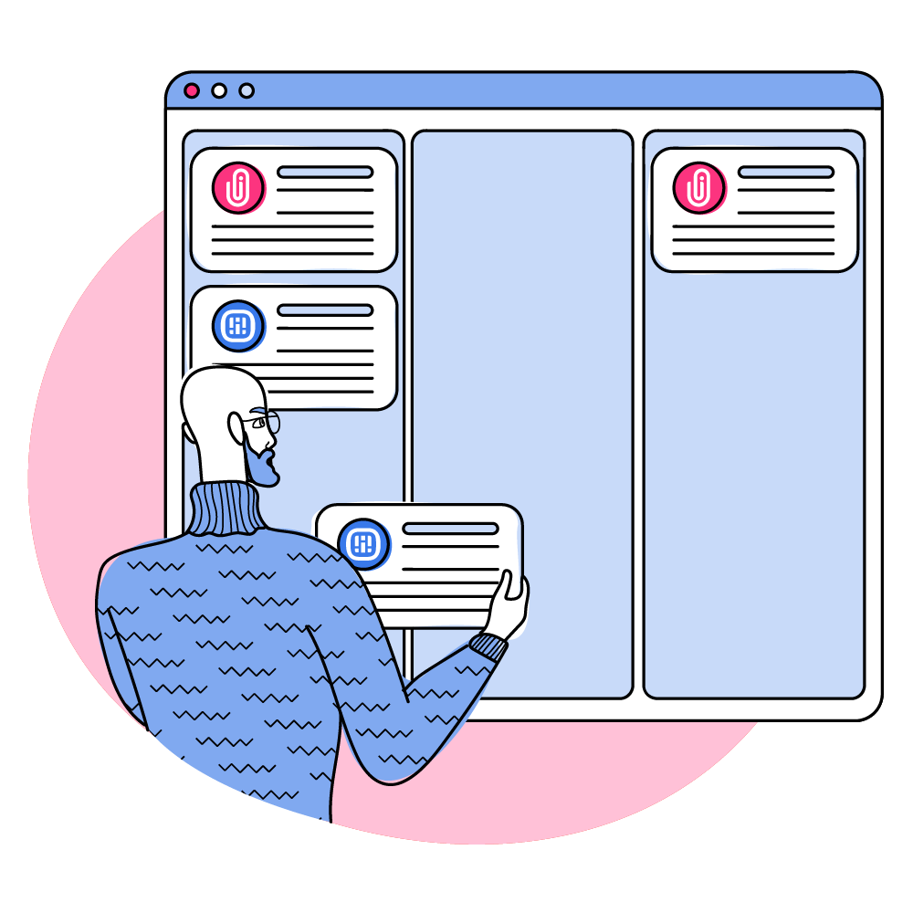
Our informational product illustrations depict products and solutions as well as tell a story. Stories can be a customer journey story or a product story. These images are specific to a product or service, and are more technical than a general scene illustration.


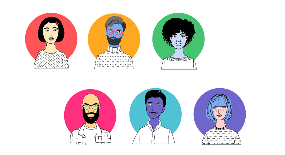
Character Illustrations
We refrain from using character illustrations where possible because we are more focused on highlighting customers and their audiences through high quality photography so that the imagery is more personable and easier to relate to. But when needed we do use characters, we want to make sure that they are charismatic and diverse, just like our clients and Rockers.
Example:
Effect Styling

Rounded Corners 6px
Rounded Corners 12px
Rounded Corners 18px
Drop Shadow Bottom
Gray/400 Border
Blue/400 Border
Buttons
BUTTON COLORS
BUTTON SIZES
BUTTON ICONS
Pods
MAIN PODS
Transparent
Pellentesque eu purus non orci pellentesque egestas in vel mi. Quisque et metus elementum, tempus justo a, gravida purus.
Link StyleWhite Pod
Pellentesque eu purus non orci pellentesque egestas in vel mi. Quisque et metus elementum, tempus justo a, gravida purus.
Link StyleWhite Transparent Pod
Pellentesque eu purus non orci pellentesque egestas in vel mi. Quisque et metus elementum, tempus justo a, gravida purus.
Link StyleBlack Transparent Pod
Pellentesque eu purus non orci pellentesque egestas in vel mi. Quisque et metus elementum, tempus justo a, gravida purus.
Link StyleBlack Pod
Pellentesque eu purus non orci pellentesque egestas in vel mi. Quisque et metus elementum, tempus justo a, gravida purus.
Link StyleBlue/400 Pod
Pellentesque eu purus non orci pellentesque egestas in vel mi. Quisque et metus elementum, tempus justo a, gravida purus.
Link StyleCyan/400 Pod
Pellentesque eu purus non orci pellentesque egestas in vel mi. Quisque et metus elementum, tempus justo a, gravida purus.
Link StyleGray/400 Pod
Pellentesque eu purus non orci pellentesque egestas in vel mi. Quisque et metus elementum, tempus justo a, gravida purus.
Link StyleGreen/400 Pod
Pellentesque eu purus non orci pellentesque egestas in vel mi. Quisque et metus elementum, tempus justo a, gravida purus.
Link StyleOrange/400 Pod
Pellentesque eu purus non orci pellentesque egestas in vel mi. Quisque et metus elementum, tempus justo a, gravida purus.
Link StylePink/400 Pod
Pellentesque eu purus non orci pellentesque egestas in vel mi. Quisque et metus elementum, tempus justo a, gravida purus.
Link StylePurple/400 Pod
Pellentesque eu purus non orci pellentesque egestas in vel mi. Quisque et metus elementum, tempus justo a, gravida purus.
Link StyleRed/400 Pod
Pellentesque eu purus non orci pellentesque egestas in vel mi. Quisque et metus elementum, tempus justo a, gravida purus.
Link StyleTeal/400 Pod
Pellentesque eu purus non orci pellentesque egestas in vel mi. Quisque et metus elementum, tempus justo a, gravida purus.
Link StyleYellow/400 Pod
Pellentesque eu purus non orci pellentesque egestas in vel mi. Quisque et metus elementum, tempus justo a, gravida purus.
Link StyleSECONDARY PODS
Blue/50 Pod
Pellentesque eu purus non orci pellentesque egestas in vel mi. Quisque et metus elementum, tempus justo a, gravida purus.
Link StyleBlue/100 Pod
Pellentesque eu purus non orci pellentesque egestas in vel mi. Quisque et metus elementum, tempus justo a, gravida purus.
Link StyleBlue/600 Pod
Pellentesque eu purus non orci pellentesque egestas in vel mi. Quisque et metus elementum, tempus justo a, gravida purus.
Link StyleCyan/50 Pod
Pellentesque eu purus non orci pellentesque egestas in vel mi. Quisque et metus elementum, tempus justo a, gravida purus.
Link StyleCyan/100 Pod
Pellentesque eu purus non orci pellentesque egestas in vel mi. Quisque et metus elementum, tempus justo a, gravida purus.
Link StyleCyan/600 Pod
Pellentesque eu purus non orci pellentesque egestas in vel mi. Quisque et metus elementum, tempus justo a, gravida purus.
Link StyleGray/50 Pod
Pellentesque eu purus non orci pellentesque egestas in vel mi. Quisque et metus elementum, tempus justo a, gravida purus.
Link StyleGray/100 Pod
Pellentesque eu purus non orci pellentesque egestas in vel mi. Quisque et metus elementum, tempus justo a, gravida purus.
Link StyleGray/600 Pod
Pellentesque eu purus non orci pellentesque egestas in vel mi. Quisque et metus elementum, tempus justo a, gravida purus.
Link StyleGreen/50 Pod
Pellentesque eu purus non orci pellentesque egestas in vel mi. Quisque et metus elementum, tempus justo a, gravida purus.
Link StyleGreen/100 Pod
Pellentesque eu purus non orci pellentesque egestas in vel mi. Quisque et metus elementum, tempus justo a, gravida purus.
Link StyleGreen/600 Pod
Pellentesque eu purus non orci pellentesque egestas in vel mi. Quisque et metus elementum, tempus justo a, gravida purus.
Link StyleOrange/50 Pod
Pellentesque eu purus non orci pellentesque egestas in vel mi. Quisque et metus elementum, tempus justo a, gravida purus.
Link StyleOrange/100 Pod
Pellentesque eu purus non orci pellentesque egestas in vel mi. Quisque et metus elementum, tempus justo a, gravida purus.
Link StyleOrange/600 Pod
Pellentesque eu purus non orci pellentesque egestas in vel mi. Quisque et metus elementum, tempus justo a, gravida purus.
Link StylePink/50 Pod
Pellentesque eu purus non orci pellentesque egestas in vel mi. Quisque et metus elementum, tempus justo a, gravida purus.
Link StylePink/100 Pod
Pellentesque eu purus non orci pellentesque egestas in vel mi. Quisque et metus elementum, tempus justo a, gravida purus.
Link StylePink/600 Pod
Pellentesque eu purus non orci pellentesque egestas in vel mi. Quisque et metus elementum, tempus justo a, gravida purus.
Link StylePurple/50 Pod
Pellentesque eu purus non orci pellentesque egestas in vel mi. Quisque et metus elementum, tempus justo a, gravida purus.
Link StylePurple/100 Pod
Pellentesque eu purus non orci pellentesque egestas in vel mi. Quisque et metus elementum, tempus justo a, gravida purus.
Link StylePurple/600 Pod
Pellentesque eu purus non orci pellentesque egestas in vel mi. Quisque et metus elementum, tempus justo a, gravida purus.
Link StyleRed/50 Pod
Pellentesque eu purus non orci pellentesque egestas in vel mi. Quisque et metus elementum, tempus justo a, gravida purus.
Link StyleRed/100 Pod
Pellentesque eu purus non orci pellentesque egestas in vel mi. Quisque et metus elementum, tempus justo a, gravida purus.
Link StyleRed/600 Pod
Pellentesque eu purus non orci pellentesque egestas in vel mi. Quisque et metus elementum, tempus justo a, gravida purus.
Link StyleTeal/50 Pod
Pellentesque eu purus non orci pellentesque egestas in vel mi. Quisque et metus elementum, tempus justo a, gravida purus.
Link StyleTeal/100 Pod
Pellentesque eu purus non orci pellentesque egestas in vel mi. Quisque et metus elementum, tempus justo a, gravida purus.
Link StyleTeal/600 Pod
Pellentesque eu purus non orci pellentesque egestas in vel mi. Quisque et metus elementum, tempus justo a, gravida purus.
Link StyleYellow/50 Pod
Pellentesque eu purus non orci pellentesque egestas in vel mi. Quisque et metus elementum, tempus justo a, gravida purus.
Link StyleYellow/100 Pod
Pellentesque eu purus non orci pellentesque egestas in vel mi. Quisque et metus elementum, tempus justo a, gravida purus.
Link StyleYellow/600 Pod
Pellentesque eu purus non orci pellentesque egestas in vel mi. Quisque et metus elementum, tempus justo a, gravida purus.
Link StyleInteractive Elements
ACCORDIONS
Section 1
Proin convallis tellus lacus. Proin vel enim venenatis, cursus orci id, sagittis metus. Sed vel ipsum sed elit convallis malesuada in non nisl. Vivamus aliquam, tellus quis imperdiet posuere, urna erat dapibus mauris, id malesuada magna ipsum at quam. Class aptent taciti sociosqu ad litora torquent per conubia nostra, per inceptos himenaeos. Aliquam posuere ipsum in dictum dictum.
Section 2
Vivamus lacinia, ligula eget congue fringilla, ipsum leo euismod est, et molestie tortor arcu non sem. Sed quis nunc auctor est consequat elementum vel sed dui. Etiam tempus dignissim diam, rhoncus consequat elit tincidunt vitae. Aliquam bibendum ex tincidunt pellentesque rutrum.
TABS
- Tab One
- Tab Two
- Tab Three
- Tab One
- Tab Two
- Tab Three
FLOW
Flow Step 1
Flow Step 2
Flow Step 3
Flow Step 1
Flow Step 2
Flow Step 3
Forms
Text Input
Dropdown Input
Checkboxes
Choice 1
Choice 2
Radio Buttons
Choice 1
Choice 2
Brand Application
In this section we will cover how the brand is applied across multiple applications. In order to maintain consistencies across all of Rock Content’s marketing material and customer touch points, we recommend using the templates outlined here and using the following documentations when starting a new project.
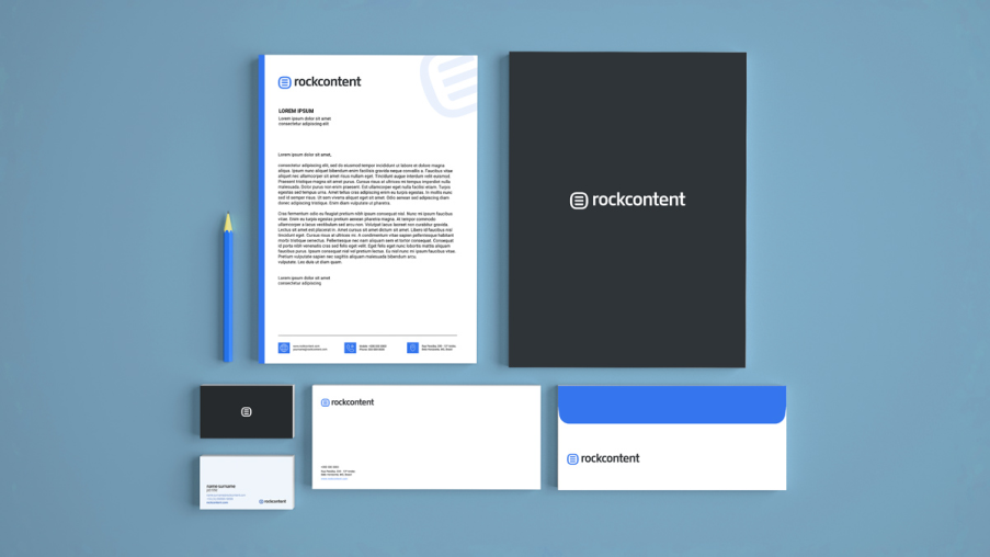
Stationary Template
Use this set of stationary templates to create new business cards, envelopes, letterheads, and folders.


Download Link Coming Soon!
Presentation Templates
As Rock Content continues to grow and create more content for our customers, for market, and for internal purposes. We created a list of presentation deck templates that will get you kick started on any presentation.


Sales Enablement


Webinars


Internal Use

Marketing Collateral
In marketing and sales, marketing collateral is sometimes considered the collection of media used to support the sales of a product or service. At Rock Content we use it to promote the brand in various ways for all our Rockers to use.

Rock Content Magazine
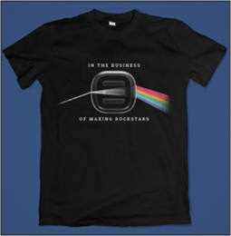
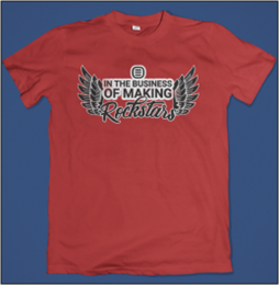
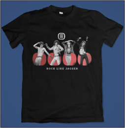
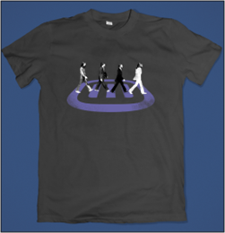
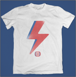
T-Shirts
Branded t-shirts for internal use only. Contact the marketing team for use.
About us
As Rockers, we communicate with authority when it comes to Content Marketing. We also highly value our sense of humor and the freedom we have with our readers, copywriters, customers and team. We are fun, but we don't force jokes, rather we let them appear naturally.
Our language should be spoken with objectivity and simplicity so that we are understood by diverse communities and people.

About Rock Content
Founded in 2013, Rock Content provides over 2,000 brands, marketers and agencies with innovative content marketing solutions, creative services, on-demand talent, and professional training. Rock acquired ScribbleLive in late 2019 and now employs over 400 people globally and maintains a talent network of over 80,000 creative professionals. Together, we all share in Rock’s mission to create growth opportunities for our customers, talent community, and Rockers worldwide.